Announcement

Collapse
No announcement yet.

MY VERSION OF ORACLE ELDER (NEW DESIGN) !! <3

Collapse
X
 
  • Filter
  • Time
  • Show
Clear All
new posts

  • MY VERSION OF ORACLE ELDER (NEW DESIGN) !! <3

    DISCLAIMER: I AM NOT A PROFESSIONAL ARTIST BY ANY MEAN.

    Before looking at my design, I think we should take a look at the original design first...
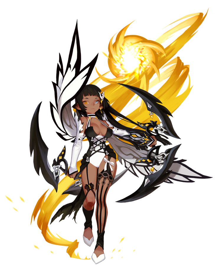
    '
    At the first glance, I was like wow! she is so pretty! The costume is sexy. Chakrams are cool and deadly.
    I see lots of black and yellow so I expected her skills to have lots of those colors. And the wings
    too. There must be a lot of airborne skills! FLYING KALI! SO EXCITED!...

    Then I saw her skills and the whole mechanism, and I was SHOOKETH to the core...

    It doesn't make sense at allllllll!!??? like girl what are those wings for? decoration? NO NO NO

    And why is the costume mostly black and white while her all skills are yellow???

    This class design is so contradicting and till this day, I still can't find the explanation behind all of this.

    Don't get me wrong though. IT IS BEAUTIFUL. Visual wise, 10/10. But the content, not so much.

    So I came up with my own design... it may not be as visually goods as the original, but I think the concept
    is more understandable. I don't know...

    Leave a comment! I would like to see what y'all think!

    THANKS!

    PS. all and all, I love her no matter what. Kali is always my number one favorite! <3


    not sure why the quality is bad here but there u go...

    Attached Files
    Last edited by ilovekyarypamyupamyu; 03-06-2018, 06:38 PM.

  • #2
    "It may not be as visually goods as the original, but I think the concept is more understandable"

    The whole point of character design is to make it as visually appealing as possible for the consumers (players). If you, the designer, yourself admitted that your concept fell short of the original, there would not be much to consider from your suggestion.

    Comment


    • ilovekyarypamyupamyu
      ilovekyarypamyupamyu commented
      Editing a comment
      Yes I had admitted that the original did an amazing job as it is visually appealing. My point here is to express my confusion toward the character design in relation to the character's play style/ machanics. For example, her costume's color scheme and her skill's color scheme which have no relationship to one another and her (unnecessary) decorative wings. Not to mention the gothic corset that goes against the whole Kali's ancient tribal aesthetic. Overall, she is beautiful but makes no sense.

  • #3
    Originally posted by ilovekyarypamyupamyu View Post
    It doesn't make sense at allllllll!!??? like girl what are those wings for? decoration? NO NO NO

    And why is the costume mostly black and white while her all skills are yellow???

    This class design is so contradicting and till this day, I still can't find the explanation behind all of this.

    Don't get me wrong though. IT IS BEAUTIFUL. Visual wise, 10/10. But the content, not so much.

    So I came up with my own design... it may not be as visually goods as the original, but I think the concept
    is more understandable. I don't know...

    Leave a comment! I would like to see what y'all think!
    Character design color scheme doesn't have to be matchy-matchy. "it's power it's fire so make it red xD" color coded character design it's lazy, and most of the time boring and not visually interesting. Her design is cohesive and has enough golden accents without overpowering her. The previous characters used some of the laziest colors schemes "black+purple/red/blue". Silver Hunter is good because her design compensates the simple color scheme by using lots of different materials and the attention to detail (veils, feathers, crystals, metallic parts, the fabric has embroidery etc) and managing to evoke the ethereal, otherwordly beauty and divinity of the class. Ray Mechanic design is good because it has a wide and well balanced color scheme that avoids making her a "color coded character" (she's pink or golden if you push it) and it's a very creative combination between a magical girl and a mecha pilot.

    The rest are just characters made to appeal edgy teens. At least Arch Heretic looks sleek and stylish, Black Mara is painful because it absolutely trashed the potentially interesting buddhism theme in favor of whatever the hell that is. Dark Avenger buys his clothes at Hot Topic.

    You also have to remember that this is a character designed for a video game, design needs to not easily get lost in the screen and it cannot be so busy to give problems to the 3D modelers and animators.

    If anything, my complain about the Oracle Elder design it that it doesn't evoke neither the divinity, the wiseness, or the power an Oracle should be associated with. It just looks like a (cute) Victoria Secret model. It fails where the Silver Hunter, who also wears a revealing costume, successed.

    I don't really feel anything coming from your design. It's extremely busy and gives the impression that it would heavily restrict movement and the character would kill herself with her own outfit. What purpose have those sticks and threads there? My first reaction when I saw her is that it's a puppet.

    "Tribal/traditional clothes" a bedlah isn't a traditional outfit, it's cabaret gear. And tribal of what? You need to ask these questions, do research and set a goal (what's supposed to repressent and what do I want to evoke?) before designing a character.

    Comment


    • ilovekyarypamyupamyu
      ilovekyarypamyupamyu commented
      Editing a comment
      First of all, thank you for a very responsive comment. It clears some of my misunderstanding about this dark class, and now I have a better idea of character design.

      My main selling point of the new design is to create a sense a flow (even though the pose is very stiff, I really have to work on that). OE's skills are very agile so I think her costume should not be skin-tight but rather more open, light and flow. So as she moves/ spins, the fabric/ threads would fly through the air making her look as if she is dancing with her clothes (which ties into the dancer's main sister). Though I agree with you that it is too busy. That really need to be fixed.

      Now I consider making a round 2 of the new design. I will take your advices and improve my next round. Thanks again!

    • Chocorroles
      Chocorroles commented
      Editing a comment
      ilovekyarypamyupamyu looking forward to it!

    • Ashura-san
      Ashura-san commented
      Editing a comment
      The healthy exchange of comments, replies and ideas on you two is very engaging. Looking forward to your round 2 version ilovekyarypamyupamyu
Working...
X